Tuesday, August 24, 2010

Jade Gelskey: Project 1, Alice (Updated:9-8-2010)

Jade Gelskey
Alice Story
August 24th, 2010

Here is my mood board


Note: For this I am not planning on using these fonts but I wanted to quickly grab a few that felt whimsical to me. I would very much like to achieve this vibe in the simplist way possible and I think there are better font solutions that I am researching. :)

Here are my sketches as well:


The Budget Information:

I want to do the standard portrait through blurb book. The book pricing starts at $35.95 but mine will be a little more costly due to the pages. I would like to do a dust jacket and hardcover.

What I am planning is to purchase at least 2 books (the instructor book and one for myself) so this had a role in what I picked.

With 41-80 Pages I am looking at a per book cost of US $35.95.

This will total out to: $71.90 (with shipping we will assume it to be around $80.00)

REVISION (Friday 27,2010):

In working with the text a little I am now thinking the book may be at the far end of that spectrum. I wanted to give an idea of what it would be of it were 81-120 since there is a chance once I get into it deeper that the page number will be in this range.

$29.95 Softcover (If I have to purchase myself)
for 2 =$59.90 if you throw in shipping lets assume more like $65.00 for both.


$41.95 hard cover with dust jacket (if we get the funding)
for 2=$83.90 if you throw on shipping lets assume like $90.00


-----------------------------------------------------------------------

Friday 27, 2010

Here are my revised Sketches and some beginning watercolors (these will get posted tomorrow, Sat.). I am now thinking to actually do cut outs of the watercolors so you see the shape in white. Ie. Watch silhouette, bunny ears maybe, the caterpillar (on the cover).

I will try this out digitally (Scan in the watercolors) and then take them out in illustrator. If I like the look I will actually hand cut them from the watercolors trying not to damage them at all so I can use the positive shape in the book as well.

An example of the positive shape is what would be on the cover. (see sketches)

Here are my sketches:


Here are two of my pages from in-design. I was having a hard time visualizing with just my sketches so I pulled together this as a better more concrete example of what I was thinking.

-------------------------------------------------------------------------------

Saturday August 28th, 2010

Here is some of my water color things I worked on.
Let me know what you think?
Try and picture the cut outs (as talked about in sketches above) ...I will work on it this next week and try some different options digitally before I actually cut them.


------------------------------------------------------------------------
September 8th, 2010
Update: Illustrations, Chapter Spreads, Cover


So as far as my illustrations I am happy with the way they turned out. I tried some different papers, but really like the texture that this kind of paper has. Anyways...I know a lot of people are having others illustrate so I am really glad I took on the extra work and did it myself. Just for a bit of a challenge.

One of the things to note is that I did every other chapter with an illustration. This ended up being 1, 3, 5, 7, 9, 11. I would have loved to do more but with the deadlines being so short this is what time allowed.

Also note that with the chapter spreads I just left the text from the second chapter. If you look below the first one and second one are the actual headers, and text that belongs with the chapter.

I did this since I am working on putting all the text in currently and am not done... I could at least show what it looks like across from text with the appropriate title relating to the illustration.

How I picked what to illustrate: I picked some notable thing I liked about the chapter, explored that, and came up with a simplified, yet meaningful representation.


As far as the cover is concerned. This is more of a preliminary idea. I am not totally sold on it yet and am still working at finalizing how I want to do the cover. Any suggestions are much appreciated.


Anyways hope you like. It was definitely fun getting to explore illustrating something for a book.

Tenia Wallace

Wow, this has been a very big project! i have been working on it like crazy! Here are some samples of what is going in my book. These are the characters that I will be using they will be sketches (done by Shelly Dansie who has been such a big help!) and the backgrounds are all going to be vector. Typography has been quite the challenge, getting it to feel right has been the hardest part I'll get it down, but then something makes me feel.. wierd about it so I will noodle on it until I feel comfortable.. which sometimes takes quite a while. All of the characters "body parts" are suppose to be white, i am creating contrast with the dark backgrounds. I really don't want everything to flow into each other, so I feel like the sketchyness of the characters really helps inhance the overall feel.


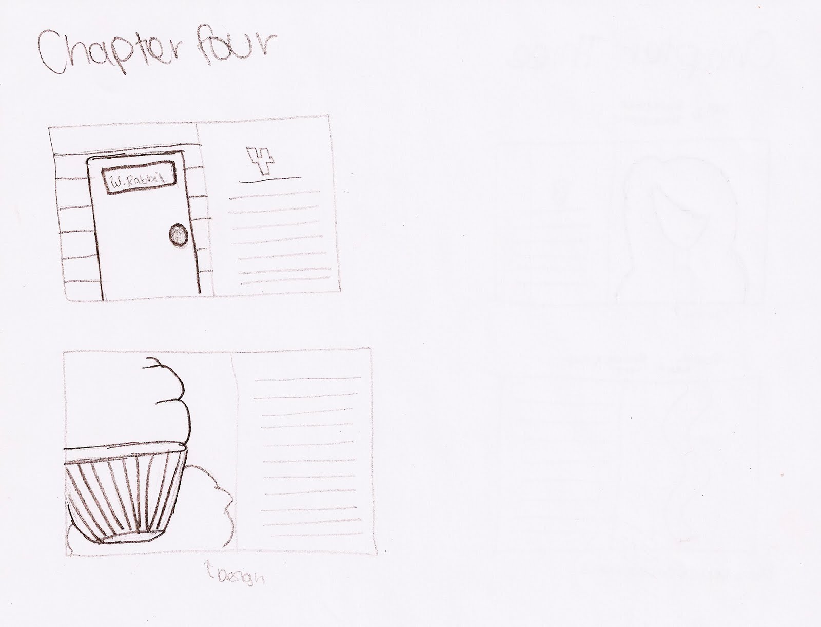
This is an object that i am trying to use the typography in. I am wanting it to look like a cup cake, this is from chapter Four when all of the "pebbles are turning into small cakes"

This will be the typography with a vector background, I am trying to get a dark look with out it being plain. The goal is to be simple but a well designed simple.

I am bringing in the sketches with the dark background. The focus will be on the characters here, this is in chapter three when alice is crying and gets all wet.


So my Alice project has been a BLAST! I am trying to do something a little different, so I am going to make the book really dark and very graphic. Its going to be filled with typography and moody colors (blacks, grays, and blues). But with the typography I am going to create different objects from the story, like a tree. I going to make a tree with more of a scripty font (kind of like the one on my mood board but not so flowy…) and I am also going to create the rabbit hole with more of a bold font, I am going to use the letters from “Down the rabbit hole”.


Haha my wonderful sketches! I am defiantly not an illustrator… It is kind of hard to see exactly the feel of the book with the black and white drawings, it all makes sense in my head if only I could just place my ideas right on to the page, but these sketches are going to help me do that…. Hopefully….


Budget:
8 x 10 Image Wrap
121-160 Pages
52.95 Each Book

Refined Sketches- 2nd


These sketches were done by the Fabulous Shelly Dansie! She has helped so much with the drawing of the characters its amazing, I am so grateful! (my Queen of hearts is above, and the Mad Hatter is below) The characters are going to have a very sketched look, it is going to go well with the vector images (they are going to contrast perfect!) I am going to leave the characters black and white because the rest of the pages are going to have full color bleeds.


Okay, so I have made a lot of progress here, I have everything organized to exactly what I am going to be creating with sketches and what I am going to be creating using vectors. These are most of my chapter layouts. I am going to have an image on one side of the page, and then I am going to have text on half of the other page. It is half because I am going to create the negative space that will be needed to balance out the photo on the opposite side (for the chapter pages) I am going to have a big number indicating what chapter it is (I.E chapter 2, 3, 4 etc….)


How this is laid out is the first sketch is going to be the chapter heading page. As you can see I have an “image” and next to it there is a page with a 1 and lines (lines=text) the following pages that just have text will be centered on the page with a number on the bottom telling what page it is. Then when it comes to the next illustration (I am going to do 2 for each chapter) I am going to have the image then the text filling the whole next page.


To kind of explain the bottom image (the one with the girl) she is not flipping anyone off…. She is holding a bottle! Hahaha my family looked at it and started to bust up because it looks like she is giving you the finger. But shes not :)


I feel like I have a really good direction for the project, I really need to start designing my pages because the typography objects are going to be very time consuming… (worth the work… I hope so….) Im SOOO excited for this project though! I cant wait until its done to see what it looks like


Joe Rawlings // project 1 alice

CHAPTER HEADINGS AND SPREADS//

Here is a rough that gives the general feel that I would like to achieve for my chapter headings, which is where all of my illustrations will be located. I really like the silhouettes that are created by the lighting as well as the limited pop colors.

I think that I am going to have each chapter have a different colored background. The colors will come from the book cover ( which is under construction right now). I have also been playing around with ghost images and how I could apply them to the spreads though out the book as well to add a little bit more texture and another level of interest.


SOME REFINING

I am excited about these cover ideas, I just hope that they work out as planned...

some more spread options...

experimenting for the cover shot...

possible alice figure//

budget: 51.95 +shipping and handling

Katie Poloni- Project 1 Alice

Book Concept: This version of Alice in Wonderland features a new twist on the original images by Lewis Carroll. By applying different patterns and colors to the originals, I was able to create a new version of how alice experienced her adventures in Wonderland.


Budget 10x8 book
121-160 pages
Image Wrap $52.95

NEW SKETCHES

Here are some other old books that I have found for inspiration:


I decided that I'm going to stick with more of this style of classic book design with the muted colors and vintage feel, I really liked the example that I had in my mood board:

I met with my illustrator and am really excited for how everything is going to turn out! We're going to start with the cover design, and work with the idea I showed in class with having the caterpillar on a mushroom, smoking his pipe and having one of the smoke o's be the "o" in Wonderland. Here's a sketch of what I'm thinking it will look like....it will also have continuations of the mushrooms leading to the back of the book.
For the layout I'm thinking of having one great picture at the beginning of the chapter, even having it spread into two pages with the text involved. During the rest of the spreads when there is only text involved I am trying to think of ways to add vintage designs in the corners or other places to make all the illustrations and designs work together. Also adding little illustrations during all text spreads every once in a while during a part that would be good to have a picture with.