Wow, this has been a very big project! i have been working on it like crazy! Here are some samples of what is going in my book. These are the characters that I will be using they will be sketches (done by Shelly Dansie who has been such a big help!) and the backgrounds are all going to be vector. Typography has been quite the challenge, getting it to feel right has been the hardest part I'll get it down, but then something makes me feel.. wierd about it so I will noodle on it until I feel comfortable.. which sometimes takes quite a while. All of the characters "body parts" are suppose to be white, i am creating contrast with the dark backgrounds. I really don't want everything to flow into each other, so I feel like the sketchyness of the characters really helps inhance the overall feel.


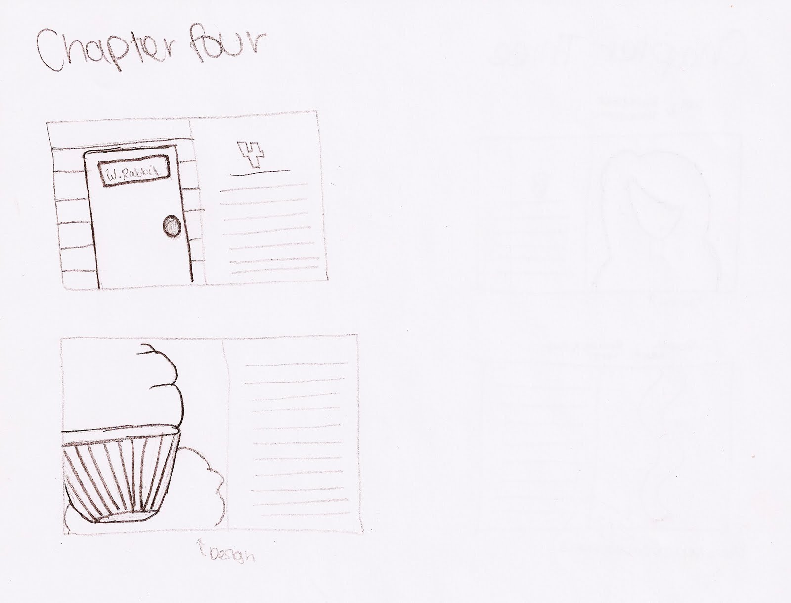
This is an object that i am trying to use the typography in. I am wanting it to look like a cup cake, this is from chapter Four when all of the "pebbles are turning into small cakes"
 This will be the typography with a vector background, I am trying to get a dark look with out it being plain. The goal is to be simple but a well designed simple.
 I am bringing in the sketches with the dark background. The focus will be on the characters here, this is in chapter three when alice is crying and gets all wet.


So my Alice project has been a BLAST! I am trying to do something a little different, so I am going to make the book really dark and very graphic. Its going to be filled with typography and moody colors (blacks, grays, and blues). But with the typography I am going to create different objects from the story, like a tree. I going to make a tree with more of a scripty font (kind of like the one on my mood board but not so flowy…) and I am also going to create the rabbit hole with more of a bold font, I am going to use the letters from “Down the rabbit hole”.
Haha my wonderful sketches! I am defiantly not an illustrator… It is kind of hard to see exactly the feel of the book with the black and white drawings, it all makes sense in my head if only I could just place my ideas right on to the page, but these sketches are going to help me do that…. Hopefully….


Budget:
8 x 10 Image Wrap
121-160 Pages52.95 Each Book
Refined Sketches- 2nd

These sketches were done by the Fabulous Shelly Dansie! She has helped so much with the drawing of the characters its amazing, I am so grateful! (my Queen of hearts is above, and the Mad Hatter is below) The characters are going to have a very sketched look, it is going to go well with the vector images (they are going to contrast perfect!) I am going to leave the characters black and white because the rest of the pages are going to have full color bleeds.
 Okay, so I have made a lot of progress here, I have everything organized to exactly what I am going to be creating with sketches and what I am going to be creating using vectors. These are most of my chapter layouts. I am going to have an image on one side of the page, and then I am going to have text on half of the other page. It is half because I am going to create the negative space that will be needed to balance out the photo on the opposite side (for the chapter pages) I am going to have a big number indicating what chapter it is (I.E chapter 2, 3, 4 etc….)
How this is laid out is the first sketch is going to be the chapter heading page. As you can see I have an “image” and next to it there is a page with a 1 and lines (lines=text) the following pages that just have text will be centered on the page with a number on the bottom telling what page it is. Then when it comes to the next illustration (I am going to do 2 for each chapter) I am going to have the image then the text filling the whole next page.
To kind of explain the bottom image (the one with the girl) she is not flipping anyone off…. She is holding a bottle! Hahaha my family looked at it and started to bust up because it looks like she is giving you the finger. But shes not :)


I feel like I have a really good direction for the project, I really need to start designing my pages because the typography objects are going to be very time consuming… (worth the work… I hope so….) Im SOOO excited for this project though! I cant wait until its done to see what it looks like
Tenia, I am loving what you have so far! I love how you are approaching the typographic illustrations. The mushroom is my favorite :)
ReplyDeleteI really like your characters, I think they each have a personality of there own, yet work together gracefully. Your type is also coming out really well.
ReplyDeleteWhen it comes to your spreads for the chapters, I like the title in the blue over the first word.
I like your illustrations. They really add to the funky feel of your book. They are definitely dark but in a good way!
ReplyDeleteOne issue I think there is is with your chapter title under the number "1" on your spread. It is really hugging the body text close and is very distracting especially when reading the first line.
Also the one with the heading "2" the placement of the text seems off kilter (the title is not centered under 2, text seems off a little). And again the title is to close. I am sure a little adjustment will solve this easy.
These look good, well done! I would say though I would avoid using gradients like you did in the cork of the one of Alice, where every other color is flat is seems out of place to have one random gradient, it's also a warm color, which stands out too. Try a shade of gray I think. Best of luck, looks good.
ReplyDeleteThe overall project is great. You mentioned that you were struggling with typography and I think that bringing in other fonts to your body text will help. You may want to try the fonts you used for the mushrooms, that will help with keeping things consistent.
ReplyDeleteI really love the patterned background, keeping the color flat but still having a design really helps keep things detailed and simple at the same time if that makes sense:) I would just be careful with the flatness of all the colors, like the cupcake spread, maybe have one color that is a little more juicy so the entire page is not flat...
ReplyDeletelooks great!!!:)
So...I'm seeing that your illustrations are going to be displayed in the book separately from the fully text pages. This makes me wonder if the typographic illustrations will be separate as well or if they will be incorporated on the text pages.
ReplyDeleteI think you've made great progression on your illustrations because it is time consuming, however, keep the style the same, I feel like the mad-hatter has a different style & line quality from the rest of the illustrations. I like the color scheme you've chosen, it serves the mood well & allows for a playful take on the story.
I like the idea and direction that this project is going and think the it is really fun and interesting. Just be careful to keep a pretty similar aesthetic through-out the entire book. Like if you have these kind of cartoon like illustration try to keep that feel in you cover design, chapter design, typography and everything else.
ReplyDeleteI love your typography, Amazing! The mushroom is my favorite. Good job.
ReplyDeleteFor the spread I like the large numbering juxtaposed with the tight lettering. The spacing on the layouts seems a little inconsistent and off- center. I think either option could be appealing, but push it in one direction or the other. The typographic illustrations look nice, they are pretty different from your illustrations and characters, but maybe as you lay things out we can see them cooperate? I like where its going, keep it up.
ReplyDeleteI really like what you are doing with the typographic illustrations. I am not the biggest fan of the font you are using at this point.. Impact right? I think it is overused. See if you have any gothic fonts.. like Franklin Gothic, News Gothic, Trade Gothic... Trade Gothic would be my choice, it still has blocky forms like the font you're using now but the letters are better constructed *and* it has all sorts of weights you can experiment with. That might work to your advantage to be able to use lighter weights, for example on the frosting of the cupcake and a heavier weight on the bottom.
ReplyDeleteAnd, if you don't have any of those fonts they should be on the lab computers. :)
ReplyDelete